“Neighborhoods and Shared Memories” (Nuestros vecindarios y sus memorias) is a community-sourced exhibit that empowers its members to tell the story of their neighborhoods in their own words. The design team, working with the museum's researchers, gave shape to these contributions through the grouping of stories and artifacts around themes that emerge from the collection overall. This is a significant break from the more traditional museum exhibits where a curatorial team establishes an exhibit’s story lines; with “Neighborhoods and Shared Memories,” the community is the curator.
We worked with a plurality of voices that do not necessarily build a single narrative, but rather create a web of themes that will carry on for the museum as the project continues, in future iterations, to examine El Paso's other neighborhoods and districts. Like a casual visit to a neighborhood, where locals approach you and tell you local history from their perspective, the emphasis is on the experience of interpreting a community through the images and stories its members share. The “take away” for the visitors lies in the broadness and authenticity of the experience, and less a linear, certifiable narrative.
The exhibit is, partially, temporary. Every 18 months, a new set of neighborhoods will be on display. The exhibit furniture and casework is designed to be entirely adaptable to new configurations of artifacts and media. Eighty percent of the exhibit space is fitted for this interchangeability. The strategy saves money and material for future neighborhood exhibits. The “fixed” displays in the museum are minimal, drawing from the Museum’s own collections and giving an overall geographic shape to the program:
- a large-scale historical map from the museum collection, specially restored for this exhibit
- an animation which shows the physical history of El Paso, which required original historical research from the museum staff
- a vinyl tile floor map where children can play and rebuild the city with rubber blocks modeled after landmark buildings or typical building types
- an information table with four computer stations linking to the exhibit website, which serves as an archive for all the interviews and photos collected for the project
The changeable portion of the exhibits include two display walls along the longer sides of the gallery, an oral history theater in the center and a “message wall” at the back of the gallery. Each of the display walls is dedicated to one of the two “showcased” neighborhoods. Everything on display comes from the community. On the two display walls, the principal elements are large-scale murals, a linear display of photographs, and cases and platforms for the display of artifacts. The linear display of photographs is designed as a single gesture that spans an entire wall. We internally call it the “shelf” because it aligns the images along the bottom border. The pictures sit on this line like a shelf. The shelf also contains digital picture frames which allow for a continual display of more images pulled from the archive and from new images that were recently sent to the museum by community groups wishing to add to the exhibit. The murals serve as visual markers for the organizational themes, while the two murals that dominate the main exhibit space are commissioned from artists working in the districts.
Research
On a number of occasions, the designer visited these neighborhoods and spoke with the people that participated in the donations and the diverse stakeholders of the community. The head exhibit designer is fully bilingual and Latino himself, so communication was never hampered. It was during these visits that we got the idea of using a mural artist. Block after block, we saw murals without a single tag of graffiti because the community respected them. We also saw wonderful examples of ironwork that inspired the entrance gates.
The designers also photographed and documented the graphic language that permeates the city. The type used for the heading of the display walls was an interpretation of hand-painted signs that are so common in shops around El Paso. The color treatments that the designer used for the photomurals were inspired by similar treatments that we saw on “lucha libre” (wrestling) posters and political flyers.
Challenges
The central design challenge for “Neighborhood and Shared Memories” was the task of managing the personal intricacies of a community-sourced exhibit. This approach empowers the community in an entirely new way, but it also complicates the process of developing the exhibit because of the omission of a central curatorial role. Community sourcing does not have the organizational capacity to edit multiple stories into cohesive, accepted themes. The design team was charged with providing this form and meaning to a plethora of voices that, in the raw state, might resonate more as white noise. In order to give elocution and sense to these multiple voices, we, the designer, deemed it necessary to make explicit the parties involved in the creation of the exhibit: the museum and the community. The design must clarify their separate roles in the exhibit by making explicit their different processes and motivations. The challenge is to distinguish how these two parties differ.
Museum: In “Neighborhoods and Shared Memories,” the “community as curator” approach helps the El Paso Museum of History move closer to the community it serves. In the past, there had been much debate about the representation of underserved communities, in particular the Latino community. To alleviate this point of contention, the museum literally asked the community to participate in the process of making the exhibit over its duration. The design of the exhibit must make evident the museum’s process of collecting, researching and facilitating for the community. This is where the museum’s voice is located. This dual approach of the “museum as facilitator” and the “community as curator” clearly assigns the different responsibilities of interpretation in the exhibit display. The design must respect these boundaries by making them evident. The execution of this is discussed in the “Strategies” portion of the entry.
Community: Even with the community taking the “microphone,” so to speak, the designer is still challenged with the responsibility of preserving authenticity. The organization of these multiple voices, images and artifacts cannot be superseded with another narrative or a singular opinion from within the community—or any other order that is alien to the community. This would violate the authenticity of the community’s voice. This observation drives the design to show each piece of content as part of the whole community. The collective characteristic of the display is what provides it with an earned authenticity.
Strategy
Strategies: All of the design decisions respond to the needs of the museum or the community as presented in the “challenges” portion of this entry form. Below we will show different design moves and characteristics and explain how we deem that they serve both parties.
Multiples: The exhibit display always shows many images at once. Each donated image is placed in a visual context that it is clearly part of a large whole. The linear graphic (that we earlier called the “shelf”) is an array of images that together make a 65- or 48-foot-long graphic panel—which makes it the longest element in the entire exhibit. It shows how each piece is part of the larger context.
Collecting: The graphic “shelf” and the “information desk” at the very entrance of the exhibit show how the museum is a collector and facilitator of the community. The entire archive of images is found in the terminals. It is a digital version of “visual storage.”
Ongoing: The community can continue making contributions to the exhibit as we speak. The website accepts new donations and they will be displayed on the digital frames that are incorporated in the “shelf” graphic. This feature is an expression of the museum’s mission to reach out to the community.
Quotes over labels: The display walls are identified with the names of the neighborhoods they contain. Below the headings of Chihuahuita and El Segundo Barrio are quotes taken from the oral histories. There is no “museum” text below the headings. The narration for the wall is carried by the quotes, which are prominently displayed in speech bubbles—clearly marking them as the spoken words of a community member.
Local: Apart from the images, artifacts and stories that were donated by the community, the designers sought the creative participation from the community. For the display walls, we commissioned the local artist Jesus “Cemi” Alvarado from Kalavera Studio to contribute two murals. For the entrance of the exhibit, the designers worked with the Sanchez brothers, local wrought iron artisans. Wrought iron gates are ubiquitous in El Paso. This feature displays the material culture of El Paso and its workmanship.
Big: During the collection process, the donor’s sense of pride was very evident—though not necessarily explicit—in the objects they shared. It was a big deal to donate these private objects and it was deemed a great opportunity to show pride in their way of life. In response to this emotion, the designer used scale to express the “emphatic” character of this act of donating and let everyone see their own piece of the story. To make things big was a celebratory gesture.
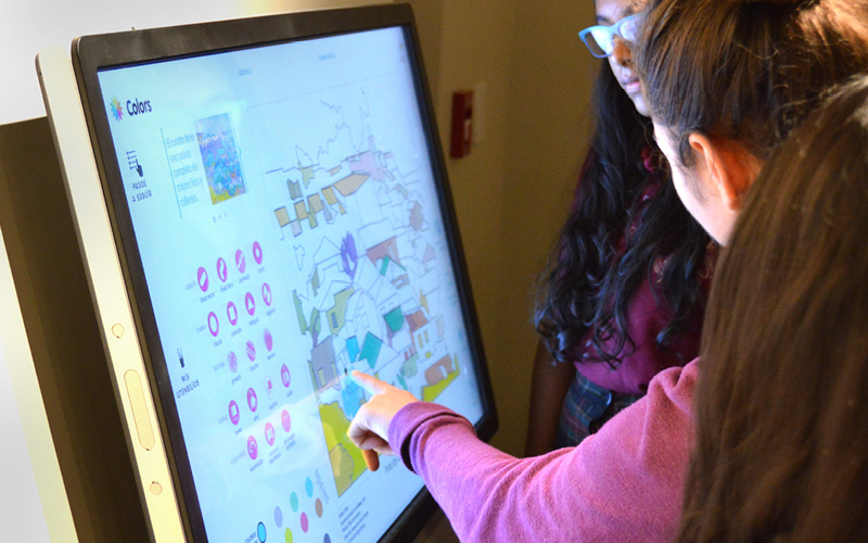
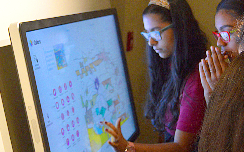
Participation: The entire exhibit hinged on community participation, so it was natural for the visitor to participate with the exhibit as well. In the images included, we featured these participatory design elements.
Effectiveness
Apart from the positive comments we have received there was an event, as well as a visitor behavioral change, that we can point to as marks of success for the design of this exhibit.
The event was the presence of Mannys Rodriguez, president of the Chihuahuita Neighborhood Association, and Osvaldo Velez, president of the Southside Neighborhood Association (El Segundo Barrio) at the cutting of the ribbon for the exhibit. In the past, both of these associations were critical of the museum for not including these communities and the Latinos of El Paso in the content of exhibits. The message that they were receiving was that they were not a part of El Paso’s history. Their presence at the exhibit shows their support for the exhibit and the opening of a better relationship between the community and the museum. It also shows that the exhibit expressed the community’s voice effectively.
The most notable mark of success for us, the designers, was a behavioral change we noticed in the visitorship. During the opening and in the days that followed we visited the exhibit to make sure everything was working and to see how people reacted. As a designer, it often happened that I became an impromptu tour guide to the exhibit, but this time the typical visitor to the exhibit had a connection with the content so it was them turning around and showing us around the exhibit. They become the tour guide. They were the experts. Different visitors would grab you by the arm to show you their pictures and share their stories. The exhibit almost became a performance space for storytelling and show-and-tell.
We also believe that—for the museum world—this exhibit is a successful model of community-sourced exhibits. We consider that the design was central in its success. The design decisions were essential in making the content accessible and preserving its authenticity. Without design, the pile of stories would become noise because of lack of form, and they would lose the eloquence that the community demanded.